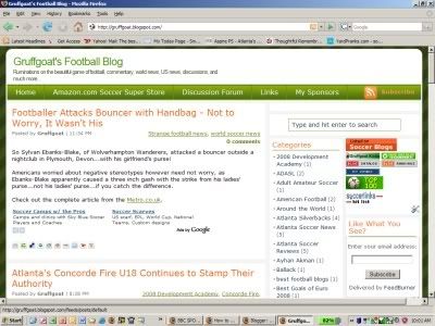
Folks, this is how Gruffgoat's Football Blog looks today, 5 July, 2008:
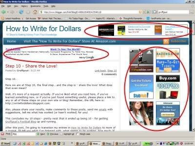
My template originally looked very much like this one:
I've circled in red the Ads I removed from Gruffgoat's Football Blog. The Ad Bar on the top right header, the Adsense bar above the first post, and the 2x3 line of 125x125 ads on the right quadrant.
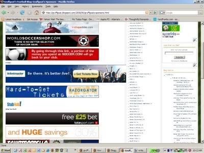
Why? After looking at my soccer site and looking at some of the highest rated by links and readership, I was thinking my site looked very busy. It looked like it was more about advertising and less about content. So about ten days in, I moved almost all of my ads to a single "Sponsors Page" that looks like this:
I'm going to track hits to this page through Google Analytics and report on how well this is working.
Cheers.


Subscribe to:
Post Comments (Atom)


Post a Comment